
PROJECT OVERVIEW
In a team of three, we were tasked to identify key issues that users face when using the original ePark IOS app. We removed and added features and gave the end product a brand new visual identity that aligns with our user's wants and needs.
CLIENT
ePark Edmonton
PRODUCT
IOS App
ROLE
UI/UX Designer
TIME
4 Weeks

GOALS
- Address issues mentioned from user reviews on the App Store
- Create a persona that reflects our user/audience
- Develop a fully functional prototype of the redesigned UI task flow

CHALLENGES
- Create a visual identity that is not too similar from the original but still makes sense with the app's context
- Adding features without being too overwhelming

ROLE
- Main UI/UX and Visual designer
- Collaborate with 2 other students majoring in computer science and minoring in design
- Keep the visuals and style consistent throughout the app
DISCOVER
App Analysis
The first stage of the process is to navigate through the original app and analyze its user interface and experience. Our team took notes of the most important factors that we needed to focus on which were the app’s UI task flow, as well as the its overall visual identity.
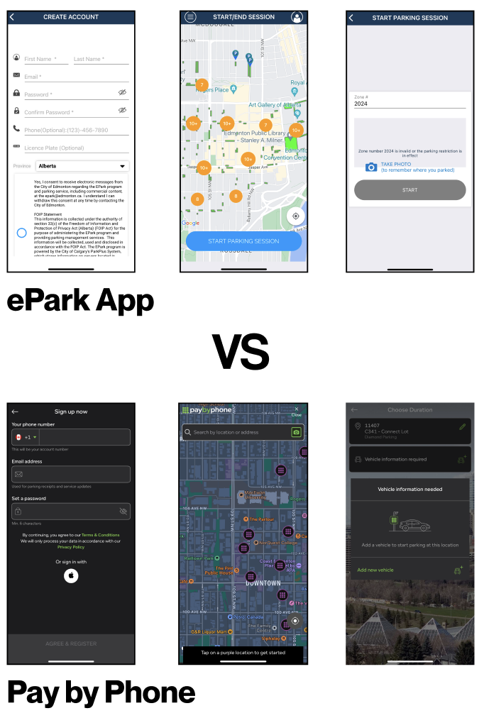
Competitors
We did our research and explored apps that are similar to but function better than ePark such Pay by Phone. In this case, we compared the two and took notes of key differences in terms of features and appearance that make Pay by Phone an overall better choice.
DEFINE
Research
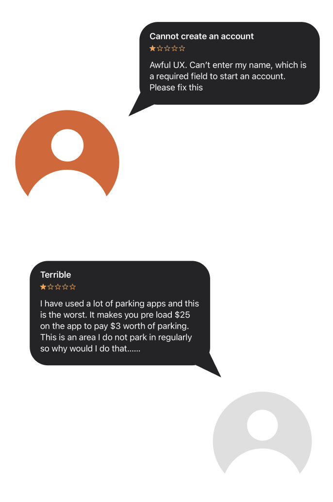
In order to create a realistic representation of our users, we interviewed real people who have used the app before. We asked about their experience, what they liked about the app, and which features they wished the app had. On top of this method, we gathered user reviews of the app from the App Store to identify key issues that they experience.
User Persona
We based our persona from the interviews we conducted. Creating a user persona helped us get a better understanding of our user, as we combined everyone’s opinion into one fictional person that represents them all.
DEVELOP
Visual Identity
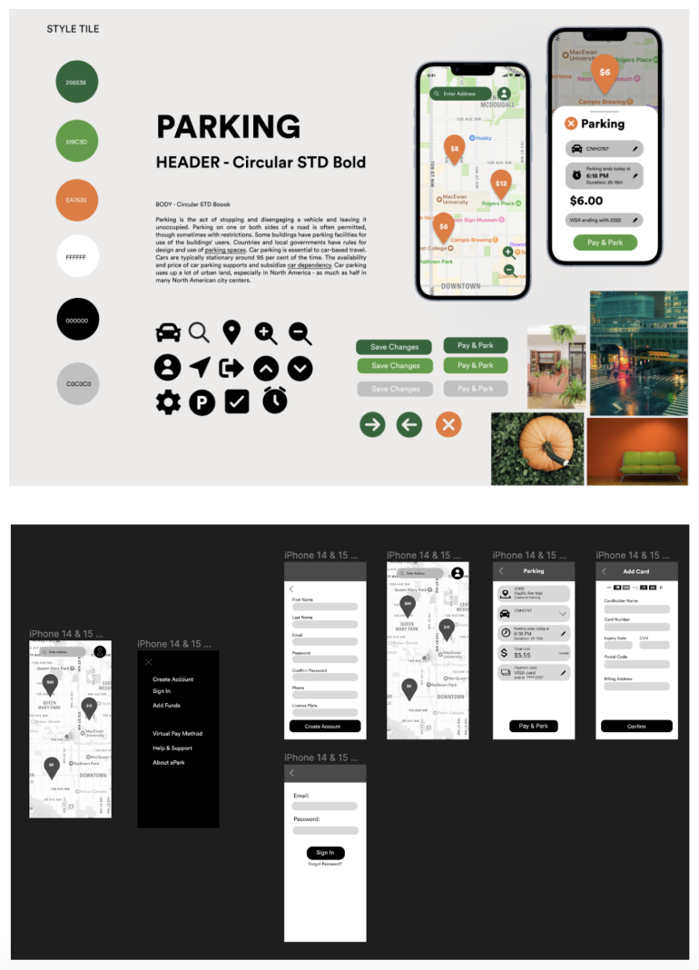
Our team wanted to give the app a unique appearance while also still recognizable as an app for parking. In this case, we used road signs for icons initial colours were red and green to represent traffic lights; however we did not want it to look “christmasy” so we went with orange.
Wireframes
After coming up with solutions such as a new payment method, a more user friendly sign in/sign up page, and overall a better UI/UX design, we started building our wireframes. We kept our high-fidelity wireframes simple just to get a sense of its UI flow and how the style tile would translate into the whole app.
DELIVER
Prototype
Our team ran the prototype several times and took note of issues that needed fixing. To ensure that we were'nt missing anything else, our team reached out to other design students and professionals to critique our app redesign.
With this, we had the opportunity to test the app in real life and observe how potential users would navigate through the app, as well as identify new issues that arose from its redesigned UI/UX.
CREDITS
TOOLS
- Figma & Fijam
- Adobe CC Illustrator
TEAM
- Angelica Billiones (Bachelor of Science, Computer Science) minor in design
- Nhi Phan (Bachelor of Science, Computer Science) minor in design

MORE! MORE! MORE!
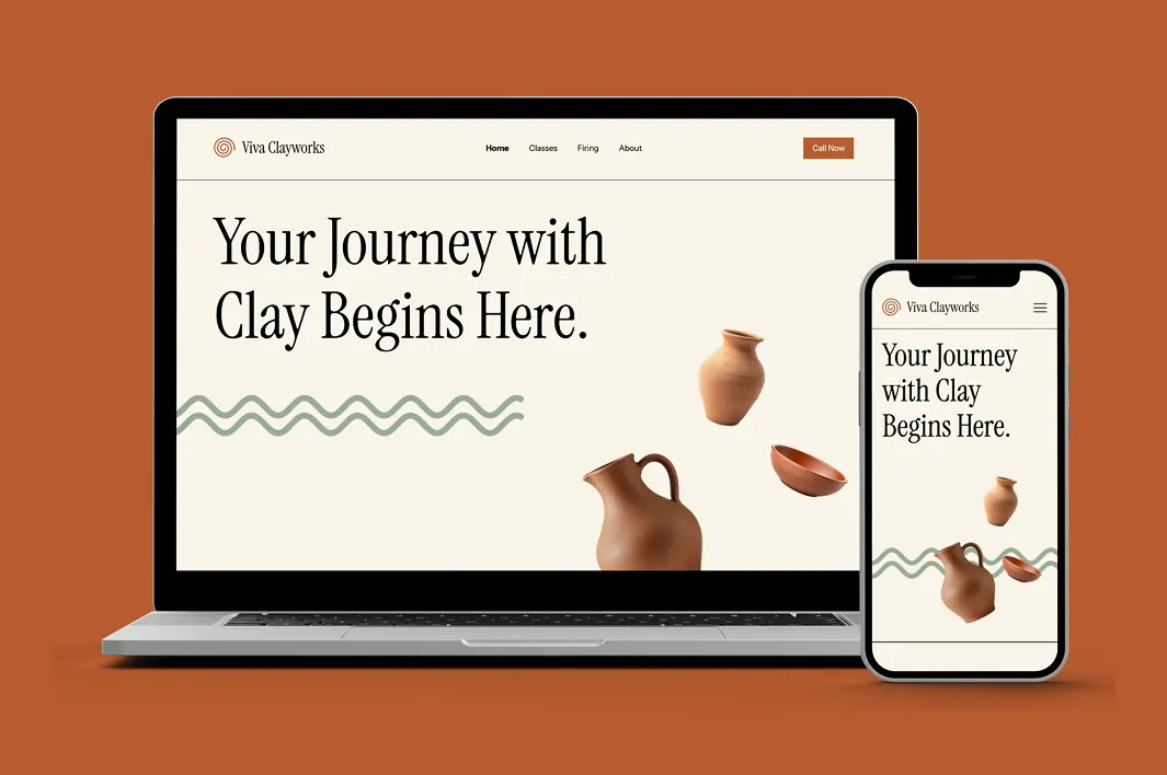
Vivaclay Works Website Redesign
Created a modern website experience for Viva Clayworks with clearer navigation, streamlined class booking, and an updated visual design.
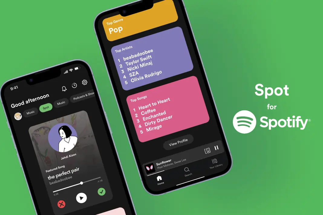
Spotify New Feature Design
Designed a prototype for a potential feature for Spotify and filmed an advertisement for it.
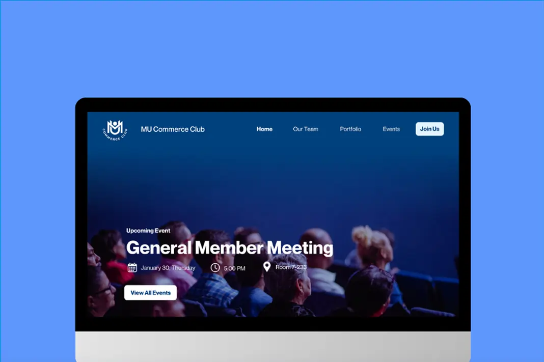
MacEwan University Commerce Club
Redesigned MUCC's old WordPress website when I got appointed as their VP of Design.
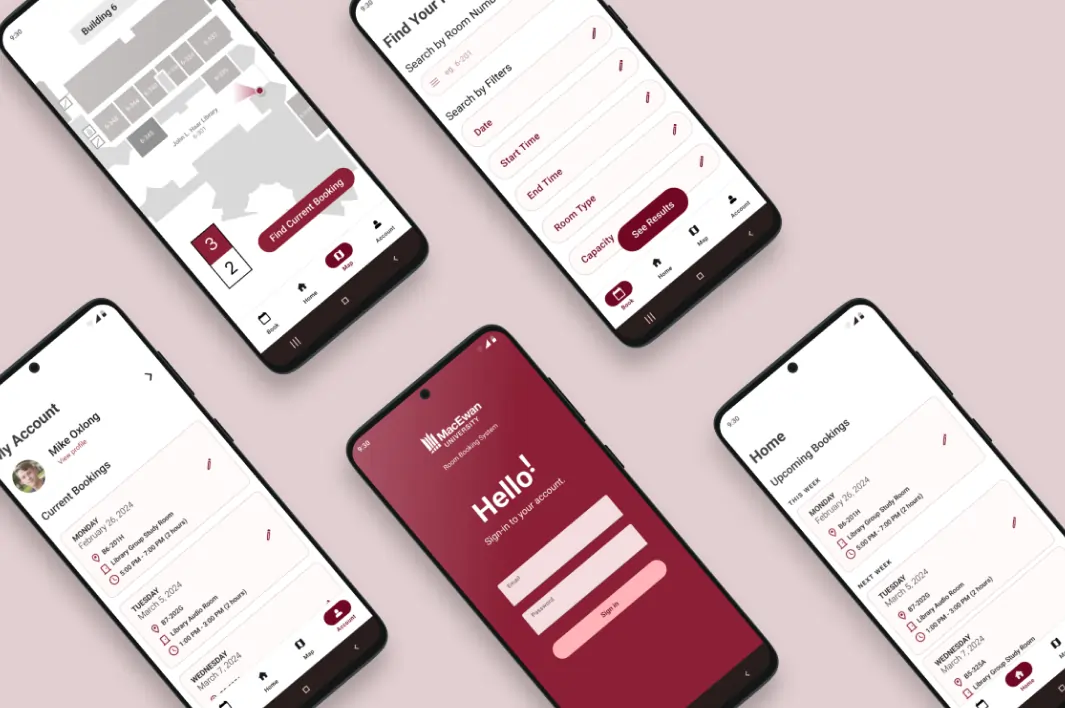
MacEwan Room Booking System Mobile App (Android)
Created an Android mobile app version of MacEwan's booking system site.
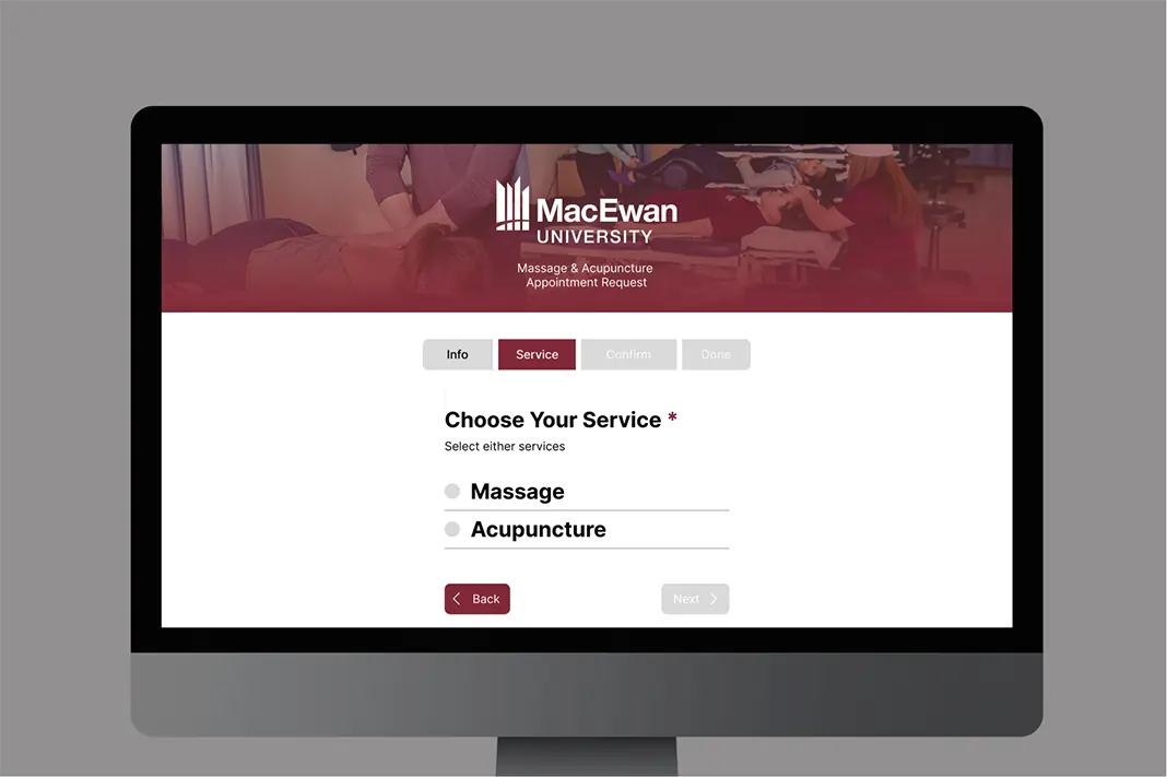
MacEwan Form Redesign
Prototyped an unofficial website that allows users to request an appointment for massage & acupuncture at MacEwan University.