
PROJECT OVERVIEW
This individual project gave me the opportunity to show my skills in interactive design. For this project, I was tasked to redesign a fill-out form that used to be a Google Form document. My plan was to create a website that is more user-friendly while also keeping the brand's (MacEwan University) visual identity.
CLIENT
Grant MacEwan University
PRODUCT
Website
ROLE
UI/UX Designer
TIME
4 Weeks

GOALS
- Analyze the original fill out form
- Identify problems and rooms for improvement
- Create solutions for better UI/UX navigation and direction

CHALLENGES
- Make the form simple enough for its purpose/the task
- Ensuring that the form is easy to understand

ROLE
- UI/UX and Visual designer
- Effectively represent MacEwan University in the website's overall visual identity
- Create a form that allows users to fill it out without any errors
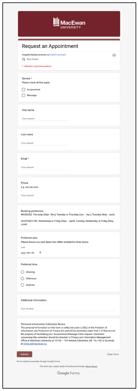
DISCOVER
Form Analysis
The first stage of this process involves testing out the form myself and identifying problems that one may encounter while filling out their information or navigating through the form in general.
DEFINE
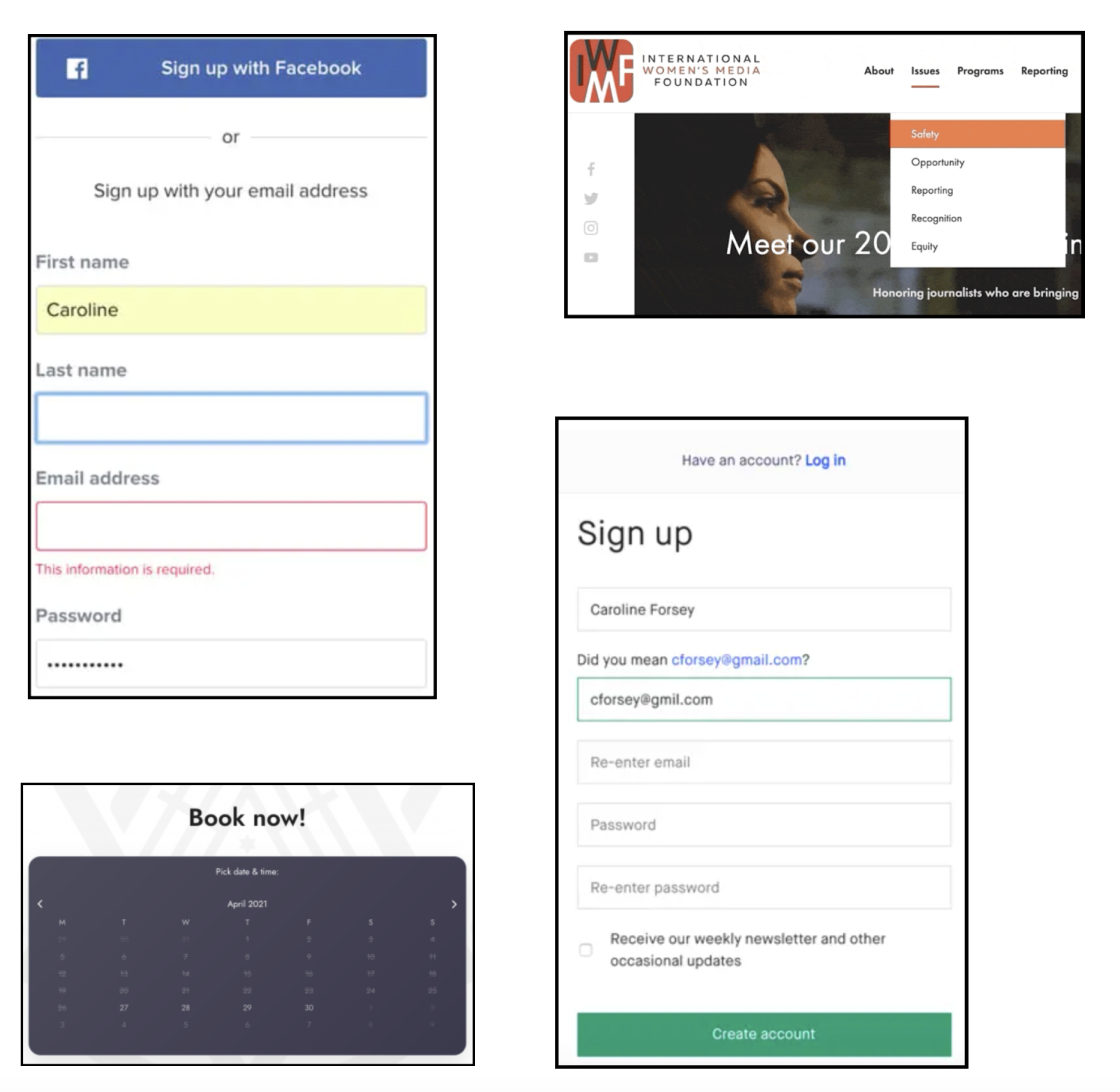
Visual Research
I explored examples of form column layout, dropdowns, error corrections, button design, and validations; which are all very important elements to consider in a good form. This method helped me come up with design solutions for the issues that the user may encounter when filling out the form. Since the form is specifically for making an appointment for the university’s massage clinic, creating an effective date and time chooser was really important.
DEVELOP
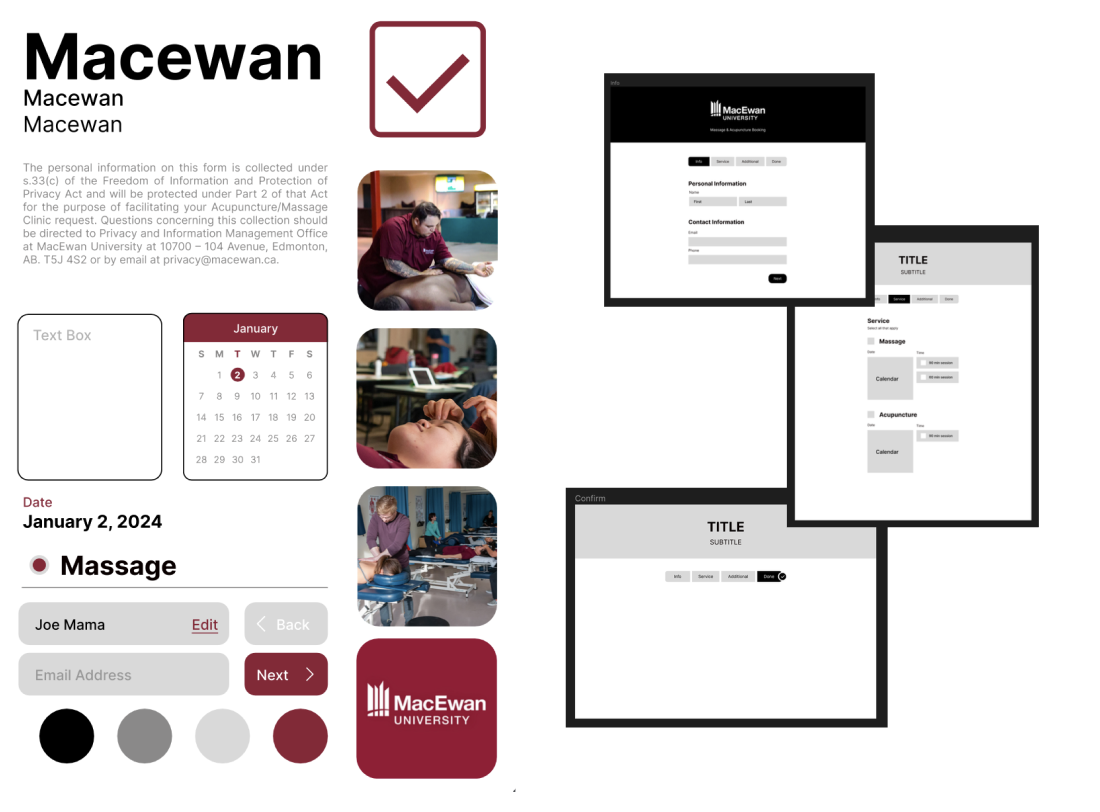
Visual Identity
To keep the design consistent with the university’s theme, I created a style tile that included colours, typography, photos, button styles, etc.
Wireframes
Since this is a website, I divided the form into pages which is better than one long form in a single page. This way, the form is easier to navigate as the user could go to or go back to specific parts of the form that they might need to edit. Creating a navigation/progress bar also helps to keep track of one’s progress and gave users a sense of how long the form is.
DELIVER
Prototype
To ensure the final prototype did not have any issues, I shared it with my fellow designers and have them critique my work. Overall, redesigning a Google Form into its own website was a fun experience as coming up with solutions for the numerous issues from the original form gave me a challenge.
CREDITS
TOOLS
- Figma & Fijam
- Adobe CC Illustrator
TEAM
- Individual Work

MORE! MORE! MORE!
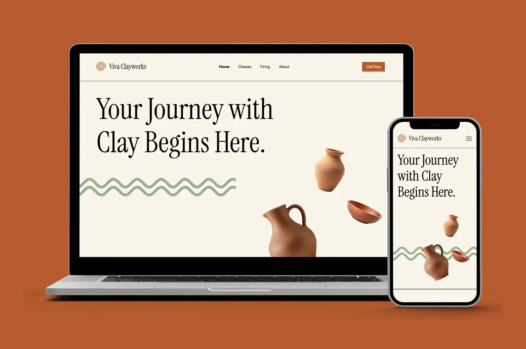
Vivaclay Works Website Redesign
Created a modern website experience for Viva Clayworks with clearer navigation, streamlined class booking, and an updated visual design.
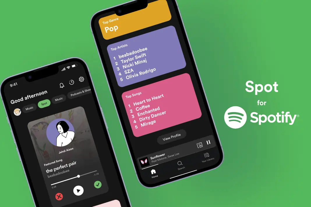
Spotify New Feature Design
Designed a prototype for a potential feature for Spotify and filmed an advertisement for it.
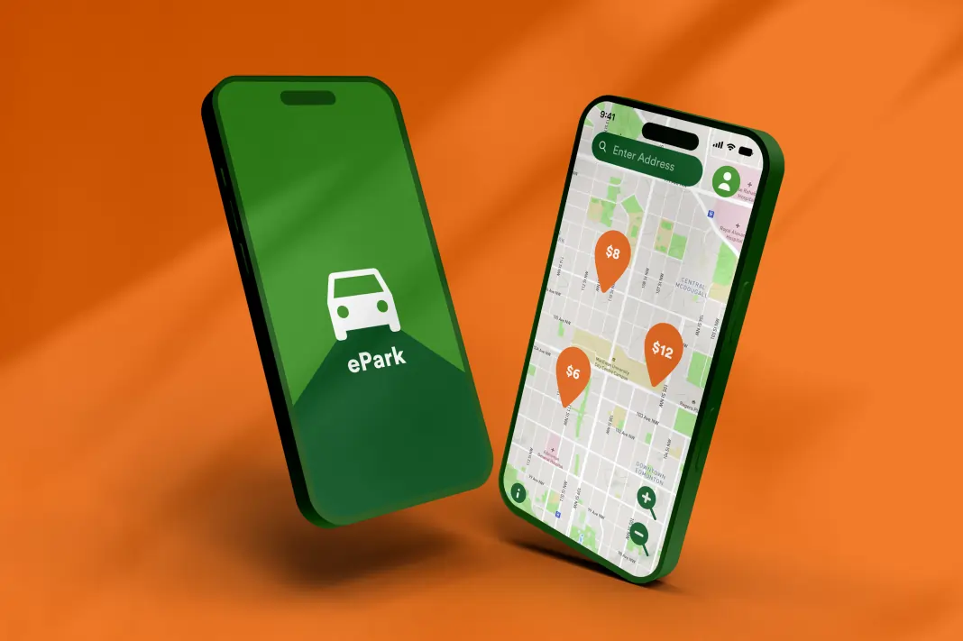
ePark App Redesign (IOS)
Solved several issues from the original and redesigned the whole app for a better user experience
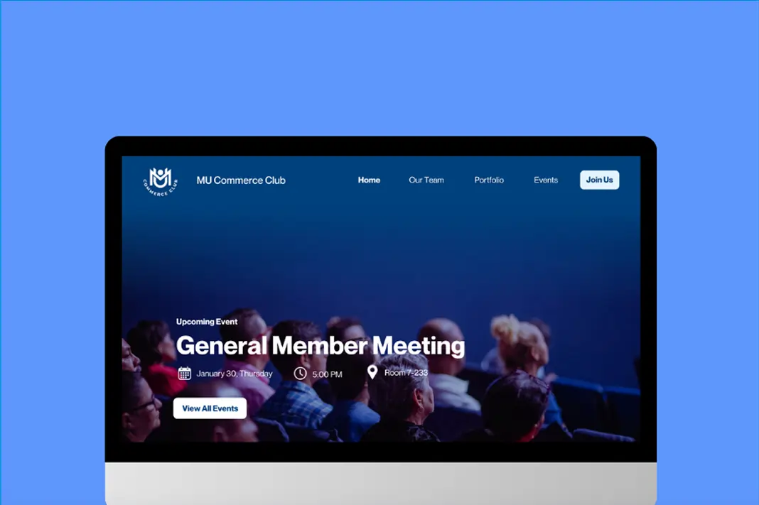
MacEwan University Commerce Club
Redesigned MUCC's old WordPress website when I got appointed as their VP of Design.
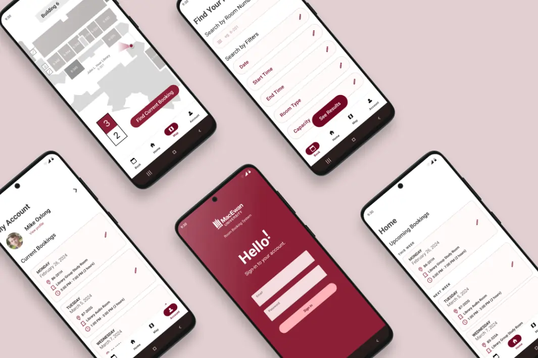
MacEwan Room Booking System Mobile App (Android)
Created an Android mobile app version of MacEwan's booking system site.