
PROJECT OVERVIEW
In a team of three, we were tasked to come up with a new feature for Spotify. For the end product, we pitched the idea by filming a video that advertises the feature.
CLIENT
Spotify
PRODUCT
Mobile App
ROLE
UI/UX Designer
TIME
4 Weeks

GOALS
- Brainstorm and create sketches for concept ideas
- Match our concept design with Spotify's brand identity

CHALLENGES
- Come up with a feature that is unique and realistic
- Create a matching system that is not exclusive for dating but also open to making friends

ROLE
- UI/UX and Visual designer
- I had the role to design and prototype the feature on Figma and the rest of the team filmed and edited the ad.
DISCOVER
App Analysis
Although Spotify is already a good app by itself, we identified features we thought the app was missing. The problem was that the app did not really have a feature to connect people. In this case, we took the opportunity to create a matching system that matched users with similar music taste. To accommodate all users, we decided that it would be better to have the feature open to any purpose as opposed to it being exclusively for dating.
Ideation
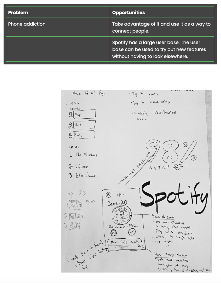
This part of the process involved our team sketching out our concept ideas which included visuals, texts, and other information.
DEFINE
Research
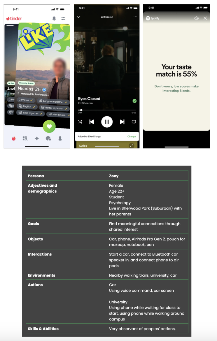
We explored other apps with a matching system such as Tinder. Our challenge was to integrate this feature into Spotify without making it look like it is made specifically for dating. We based our concept design on Spotify's UI and had the idea of swiping user profiles left and right the same way you swipe to switch between songs.
User Persona
The persona that we created reflected the demographic of who might use the feature. More specifically, our target audience are music lovers who yearn for something more out of the app; something that will allow them to connect and share their music taste with others.
DEVELOP
Visual Identity
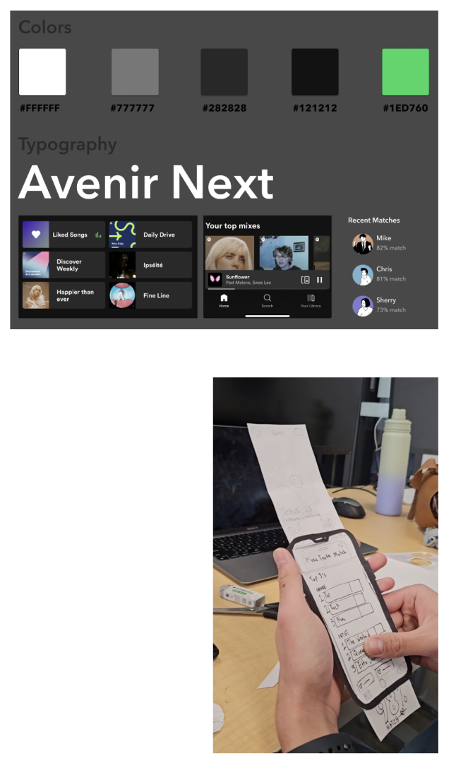
We based our style tile off of Spotify’s brand identity which included colours, typography, and the overall design of their UI. Although Spotify has a lot of dark themes, they also use a ray of bright colours for contrast.
UI Flow
Our team created our wireframes on paper to simulate how the feature would function in the real world. This method was helpful as it gave us a feel of the UI task flow and if it made sense with the feature's main purpose.
DELIVER
Prototype
When designing the prototype, I used Figma templates for Spotify’s visual elements which helped me a lot with my process as I only had to worry about designing the feature. I made sure that the feature did not seem out of place by incorporating the style tile we made into my design.
CREDITS
TOOLS
- Figma & Fijam
- Adobe CC Illustrator
TEAM
- Andre Arabejo (Bachelor of Design)
- Jehdi Aizon (Bachelor of Science, Computer Science) minor in design

MORE! MORE! MORE!
Vivaclay Works Website Redesign
Created a modern website experience for Viva Clayworks with clearer navigation, streamlined class booking, and an updated visual design.
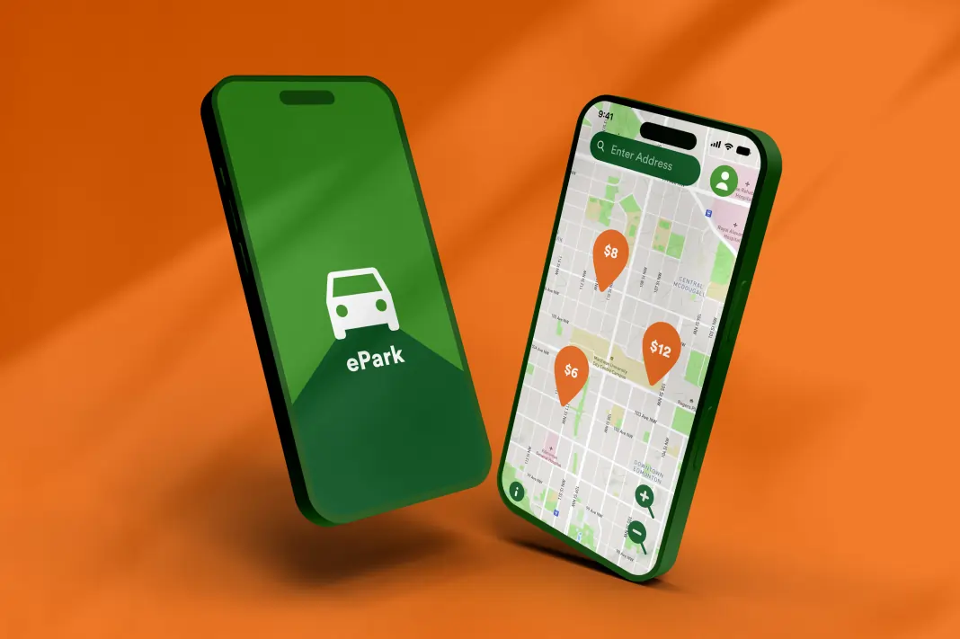
ePark App Redesign (IOS)
Solved several issues from the original and redesigned the whole app for a better user experience
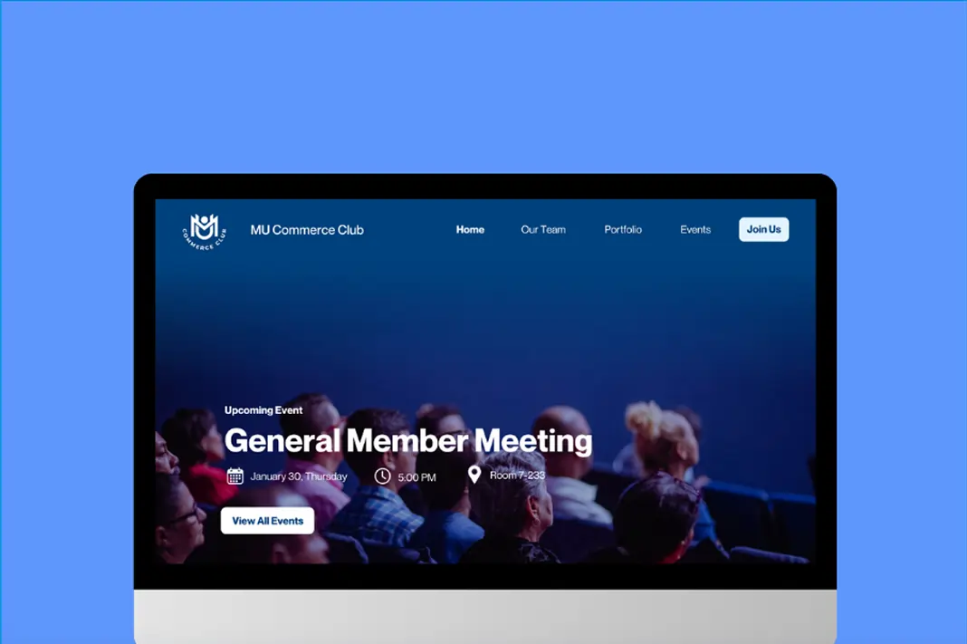
MacEwan University Commerce Club
Redesigned MUCC's old WordPress website when I got appointed as their VP of Design.
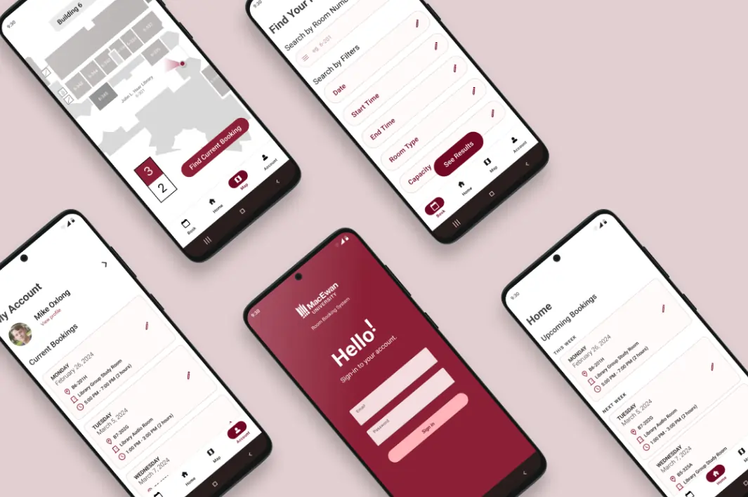
MacEwan Room Booking System Mobile App (Android)
Created an Android mobile app version of MacEwan's booking system site.
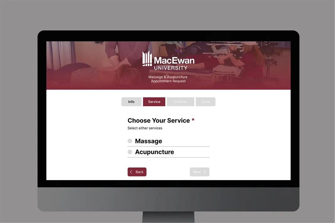
MacEwan Form Redesign
Prototyped an unofficial website that allows users to request an appointment for massage & acupuncture at MacEwan University.