
PROJECT OVERVIEW
I redesigned the Viva Clayworks website to improve clarity, navigation, and class booking. I handled the full UX process from auditing the old site and redesigning the sitemap to wireframing and creating the visual system, and then built the website using HTML, CSS, and JavaScript to bring the redesign to life.
CLIENT
Viva Clayworks
PRODUCT
Website
ROLE
Web Designer & Developer
TIME
4 Weeks

GOALS
- Audit the old website and identify key usability issues
- Redesign the sitemap, visual direction, and content structure
- Build low-fidelity wireframes that guide the new HTML/CSS/JavaScript development

CHALLENGES
- Simplifying complex information about classes, workshops, and firing services
- Cleaning up the website’s cluttered navigation and redundant pages
- Keeping the redesign modern while preserving the studio’s handmade personality

ROLE
- Led research, UX design, and visual identity creation
- Redesigned the site architecture and built low-fidelity wireframes
- Developed the redesigned website using HTML, CSS, and JavaScript
DISCOVER
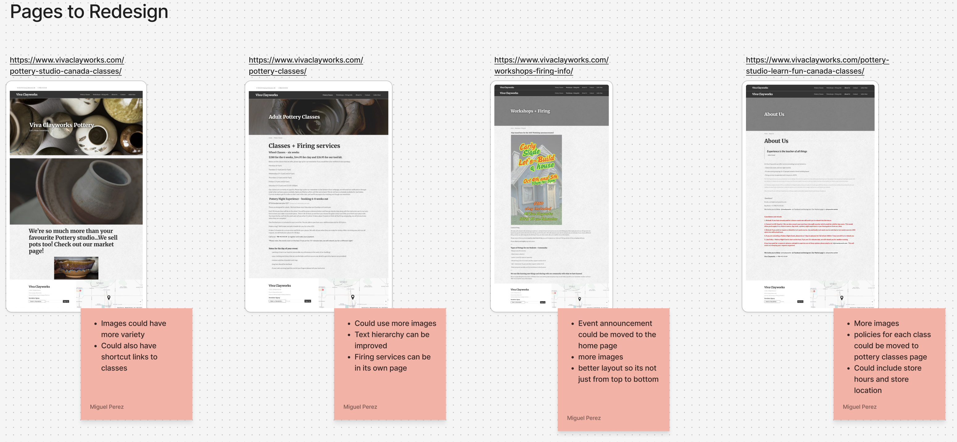
Website Analysis
The first step was to evaluate the existing Viva Clayworks website and identify usability issues. I reviewed each page, noted gaps in navigation, content clarity, and hierarchy, and highlighted opportunities to simplify how users find classes, workshops, and firing services.
DEFINE
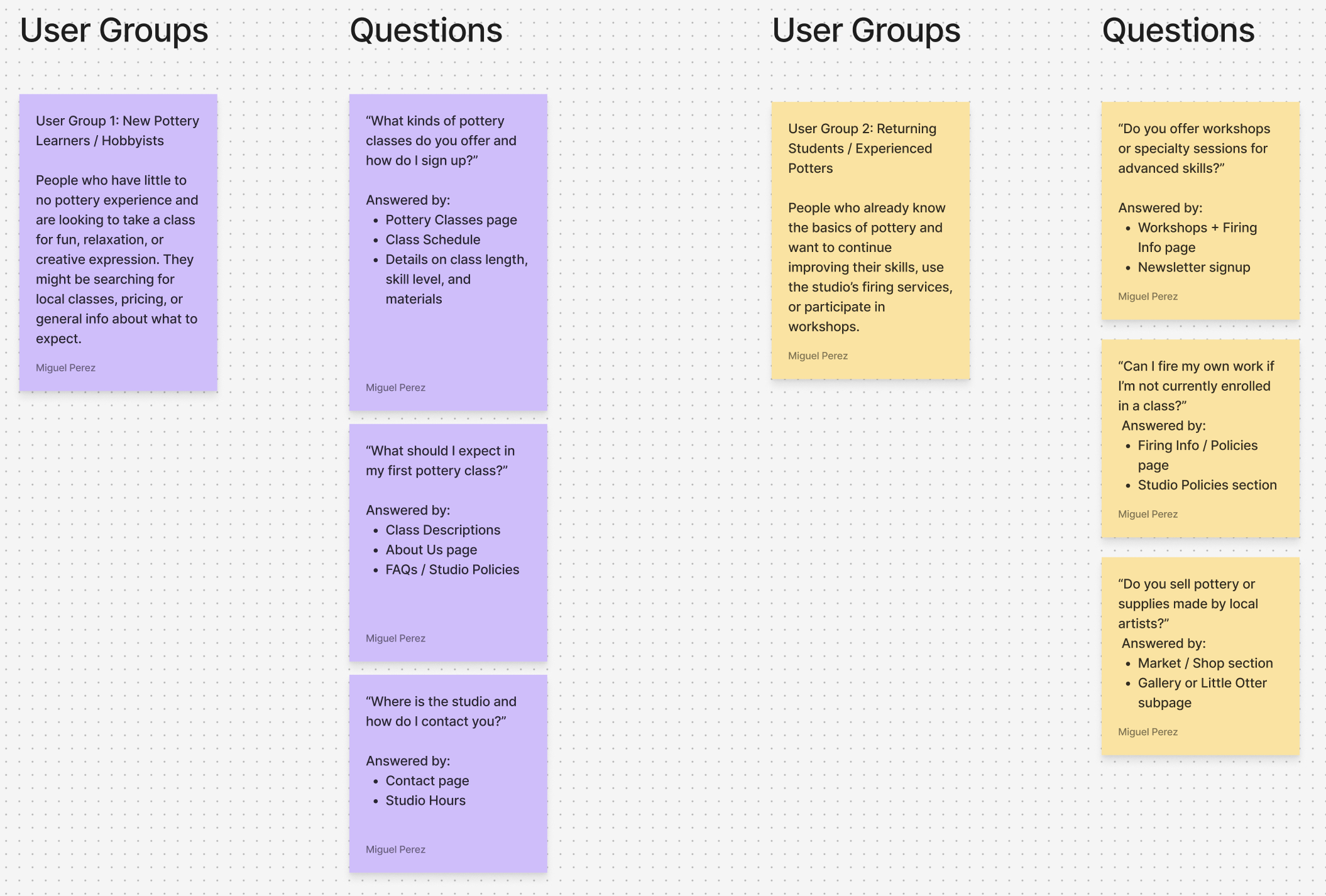
User Persona
To understand who the website serves, I defined key user groups based on their goals and experience with pottery. From this, I created a persona that represents the studio’s main audience, helping guide decisions around content, navigation, and what information users look for most.
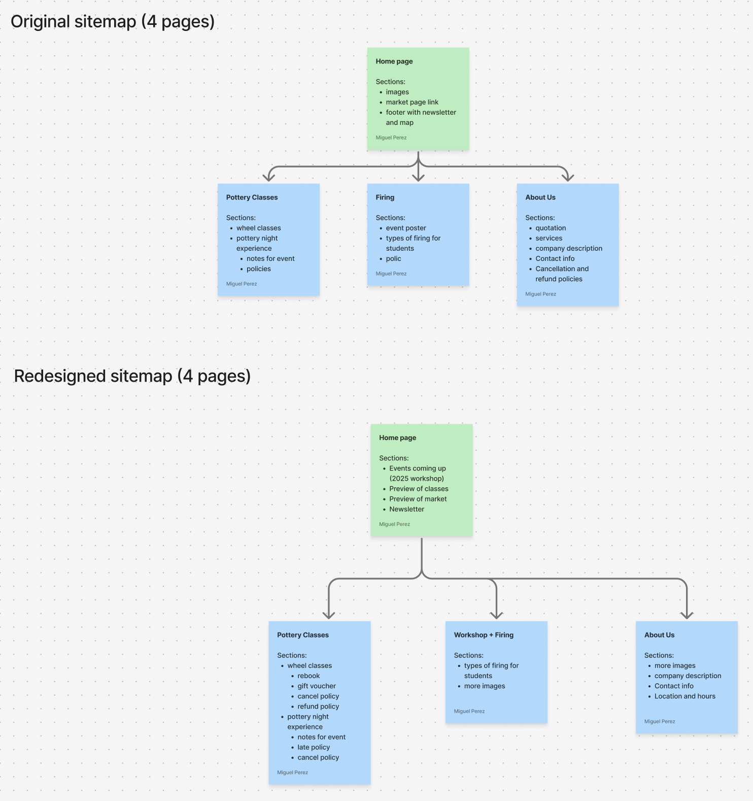
Sitemap Analysis
I mapped the original site structure and identified confusing or redundant sections. From there, I reorganized the sitemap to create a clearer path for users, grouping related content and ensuring classes, firing details, and studio information are easier to access.
DEVELOP
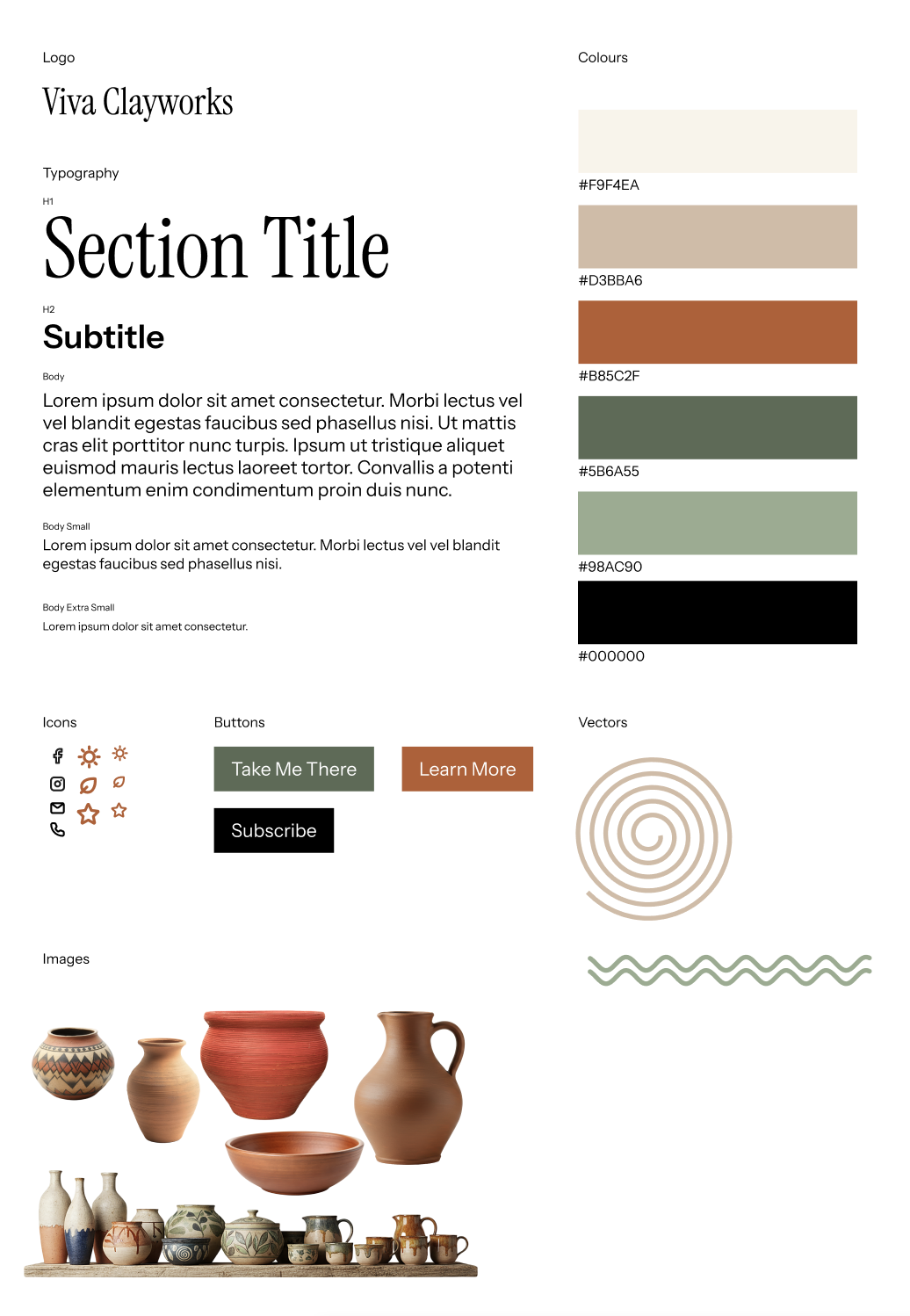
Visual Identity
I developed a refreshed visual direction for the site, pulling inspiration from pottery textures, earthy tones, and the studio’s handmade aesthetic. This style tile established the colour palette, typography, iconography, and imagery that shaped the redesigned interface.
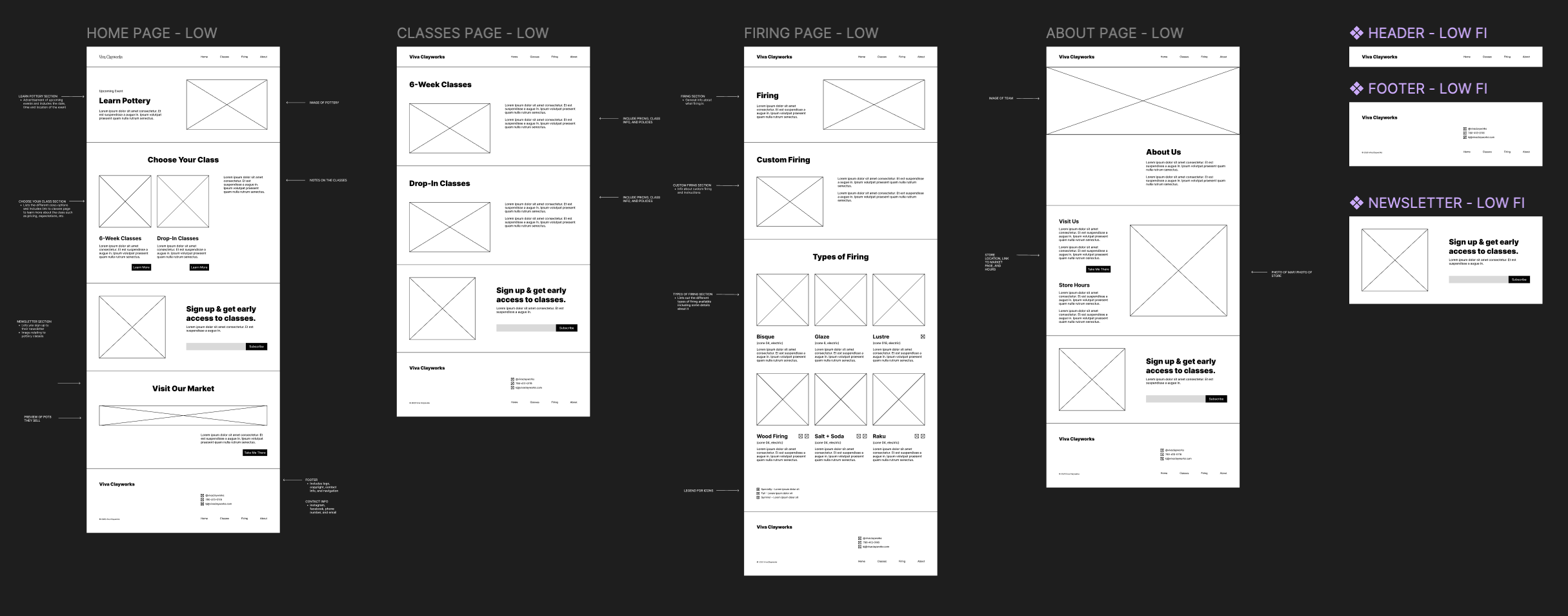
Wireframes
With the structure and visual direction in place, I created low-fidelity wireframes in Figma. These explored layout, content placement, and navigation flow, allowing me to test different ways of presenting class information, firing guidelines, and studio details before moving into development.
DELIVER
Prototype
I built the redesigned website using HTML, CSS, and JavaScript and tested it across desktop and mobile views. This prototype allowed me to evaluate how users move through the new structure, refine page layouts, and ensure the experience felt clear, welcoming, and easy to navigate.
CREDITS
TOOLS
- Figma & Fijam
- HTML, CSS, and JavaScript
TEAM
- Individual work

MORE! MORE! MORE!
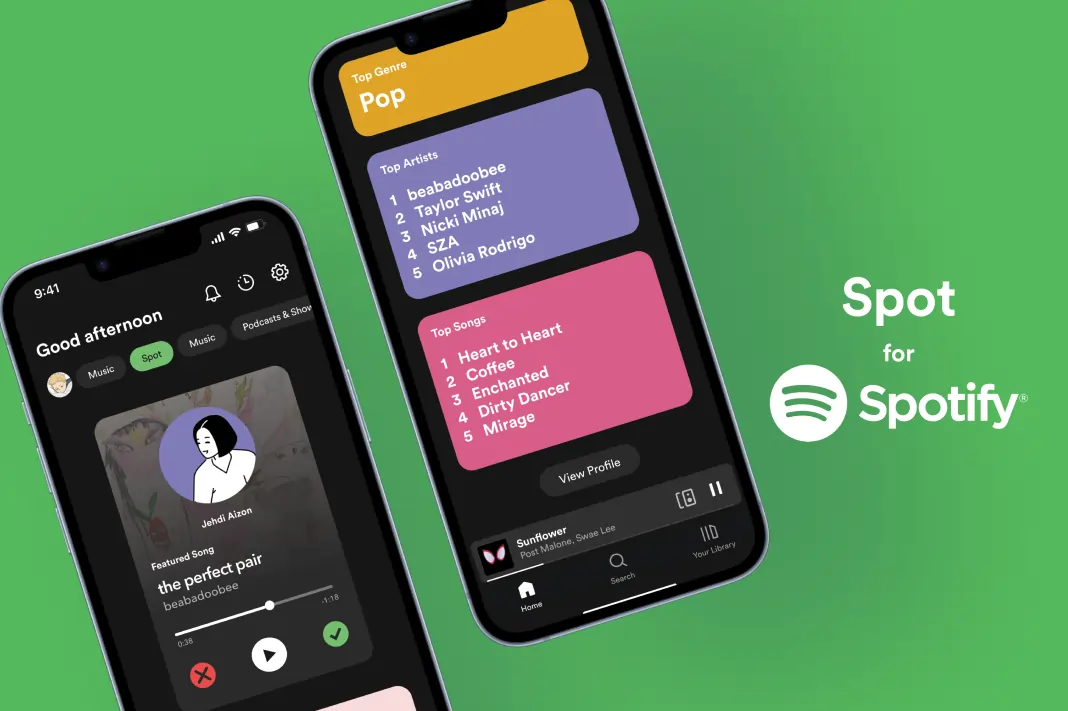
Spotify New Feature Design
Designed a prototype for a potential feature for Spotify and filmed an advertisement for it.
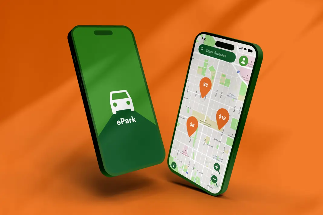
ePark App Redesign (IOS)
Solved several issues from the original and redesigned the whole app for a better user experience
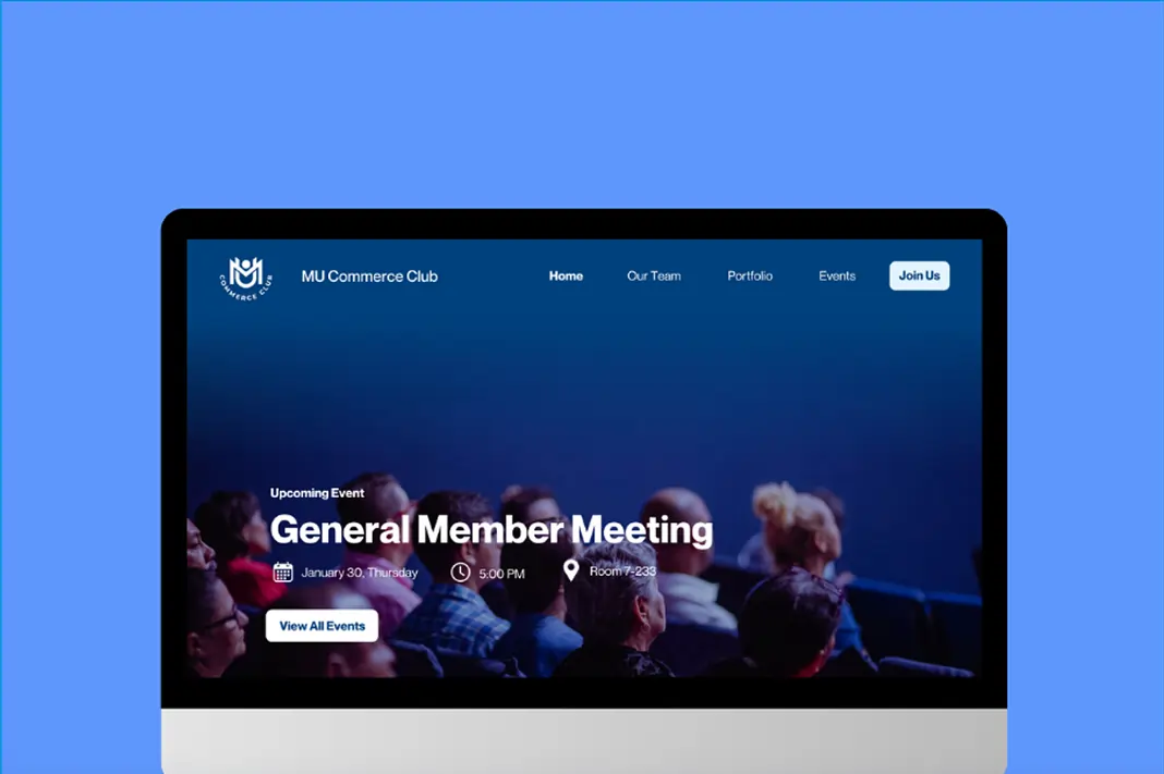
MacEwan University Commerce Club
Redesigned MUCC's old WordPress website when I got appointed as their VP of Design.
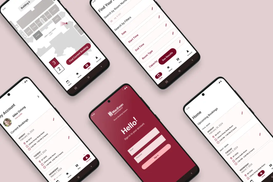
MacEwan Room Booking System Mobile App (Android)
Created an Android mobile app version of MacEwan's booking system site.
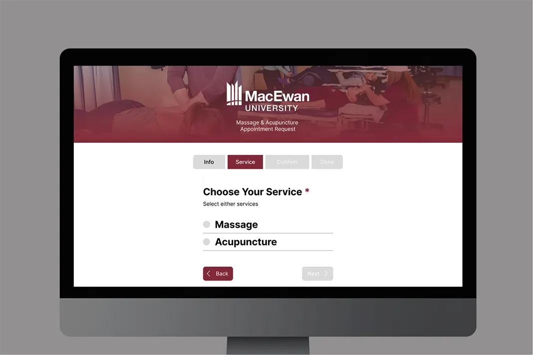
MacEwan Form Redesign
Prototyped an unofficial website that allows users to request an appointment for massage & acupuncture at MacEwan University.